One codebase I’ve inherited makes use of almost every major web trend from the past 10 years: KnockoutJs, React, Bootstrap, Font Awesome, and 3 different versions of jQuery. When getting to grips with a project like this, it’s necessary to start tuning out the noise fairly quickly in order to become productive. Many oddities may be due to technical or architectural limitations you are not aware of yet, or they could be stylistic or design patterns decided upon before your time. Of course, as you become more familiar with the codebase you can start paying attention to the minutae again.
This particular example sticks out because searching the repository for the solution yielded 200+ results
The Problem
Our application (in places) makes use of a 12-column grid system, very similar to Bootstrap. Not that we’re actually packaging Bootstrap or relying on a CDN, rather there just seems to be the relevant portion of the code pasted into main.less. Hardly best practice, but not the worst I’ve seen. The trouble with this code is that the height of elements using float doesn’t behave as you’d first assume, causing elements to overflow their container.
As a minimal working example:
<div style="background-color: lime;">
  <p>Here's some text in an element</p>
  <p style="float:left;">And some floated text, still inside the div</p>
</div>

Looking for similar code elsewhere, this had been solved by appending <div style="clear:both"></div> or adding a class .clear-fix to the parent. Why is this the case?
Flow
For a long time, the simplest way to achieve a “responsive” design was to style items with float: left; which reflows any element that would overflow the container’s horizontal axis in just the same way that we’re used to text doing. It’s important to recognise that this is not a “new row”, it’s a single row that has been wrapped around.
Perhaps it easiest to conceptualise this through float’s earliest uses - allowing text to flow around an image. (All following examples have a red border around p tags, and blue around img tags for illustrative purposes. A Codepen for these can be found here)
Consider the following markup:
<p>
    <img src="http://odavey.co.uk/img/avatar-icon.png"/>
    Lorem ipsum dolor sit amet, consectetur adipiscing elit...
</p>

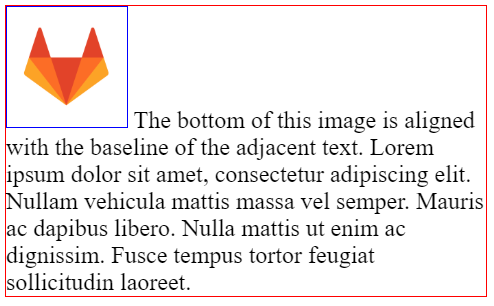
The <img> tag has a default display of inline and no concept of baseline so when used amongst text, the bottom of the image placed on the text’s baseline. As you can see, the text does not wrap to fit the image as the contents of the <p> tag is one row of content, wrapped around. The <p> tag does not care about the size of individual elements in that row.
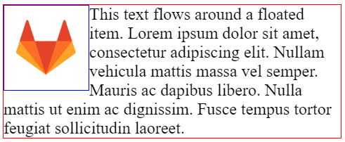
When we give our <img> float: left; what we see is more like our intention:

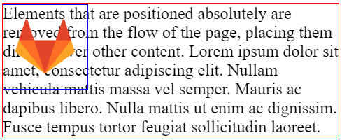
This is because floated elements are an exception to the normal flow of the document. The element is placed within the DOM and content is allowed to flow around it. Compare this with position: absolute; which completely removes the element from the flow of the page and places itself on top of flowed content.

However, we find ourselves in trouble when the floated content greatly outweighs the other content. The parent element doesn’t have enough flow content to size its height preventing us from styling a background or border around our floated content.

Finally, to return to our first example, floated content still abides its padding and margin rules which can position it entirely outside its container
<div style="background-color: lime;">
  <p>Here's some text in an element</p>
  <p style="float:left;">And some floated text goes here, still inside the div</p>
</div>

Clearfix
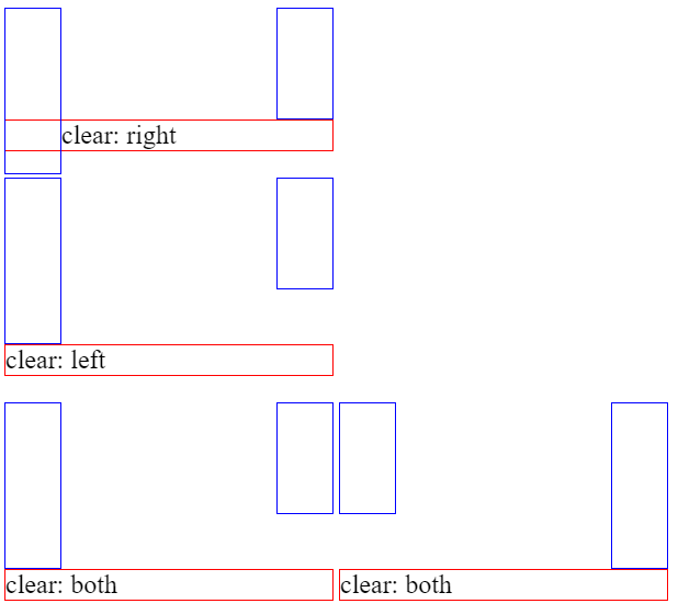
The clear CSS rule allows us to position content below floated items but still comply with standard flow rules. By giving an element clear: both; it will automatically start flowing from the tallest floated element on either side, thereby sizing the parent to fit the height of the floated elements.

Ordinarily, this wouldn’t work without content to start the flow but we can work around as the ::before and ::after pseudo-selectors have a content property we can set which forces a reflow with the styled display type:
.clearfix::after {
    content: "";
    display: block;
    clear: both;
}
Adding this to the final floated item gives us the height we need to continue flowing content on the remainder of the page.
Modern Solutions
Thankfully, in the years since float was introduced, flexbox has arrived giving us more flexibility in positioning our box-model objects. We now have more spacing and alignment options than left vs right and can do so across two whole axes! So how can we use to recreate our column system without the need for .clearfix?
First of all, we need a container with display: flex; or display: inline-flex;. Borrowing Bootstraps nomenclature, we have the rules for a row as follows:
.flex-row {
    display: inline-flex;
    flex-direction: row;
    flex-wrap: wrap;
    justify-content: flex-start;
    align-items: flex-start;
    align-content: flex-start;
    width: 100%;
}
These rules make all child elements use what we’d consider the default rules for flow content. align-items pushes to the top of the container, justify-content to the left, and align-content ensures the top of each child stays consistent.
To create the columns, we simply need to define classes matching a set width:
.flex-col-1 {
    box-sizing: border-box;
    width: percentage(1/12);
    padding: 0 0.5rem;
}

.flex-col-2 {
    ...
Setting box-sizing: border-box; here is an important step. I have seen (and admittedly, written) a lot of styling over the years held together by ad-hoc calculations to fit a number elements neatly within their container. By default box-sizing uses the value content-box which excludes padding, margin, and border, but border-box encompasses what we generally perceive as the “full size” of the element. No more width: calc(20% - 6px);!
The final problem we have is that there’s a lot of tedious typing to create these .flex-col-X classes. What if this isn’t quite right and I need to tweak these in 12 different places. Since we are using less we can write a CSS class generator:
.generate-flex-cols(@n, @i: 1) when (@i =< @n) {
    /* Define class for this width-step */
    .flex-col-@{i} {
        box-sizing: border-box;
        width: percentage(@i/@n);
        padding: 0 0.5rem;
    }

    /* Recursively call with next width-step */
    .generate-flex-cols(@n, (@i + 1));
}

/* Kick it off with 12 columns */
.generate-flex-cols(12);